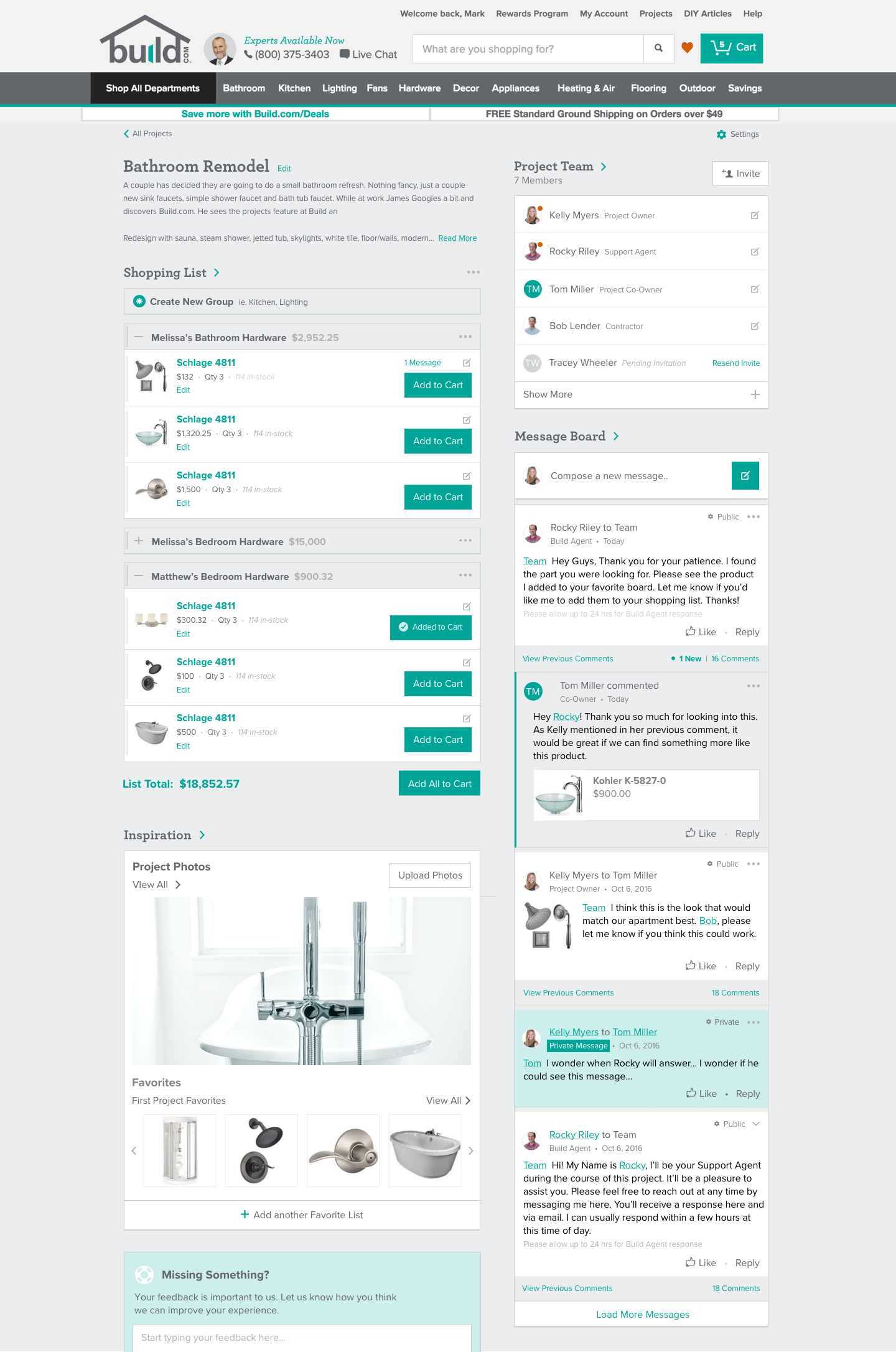
Build.com has a mission to help you with your home improvement project from start to finish.
Projects Tool
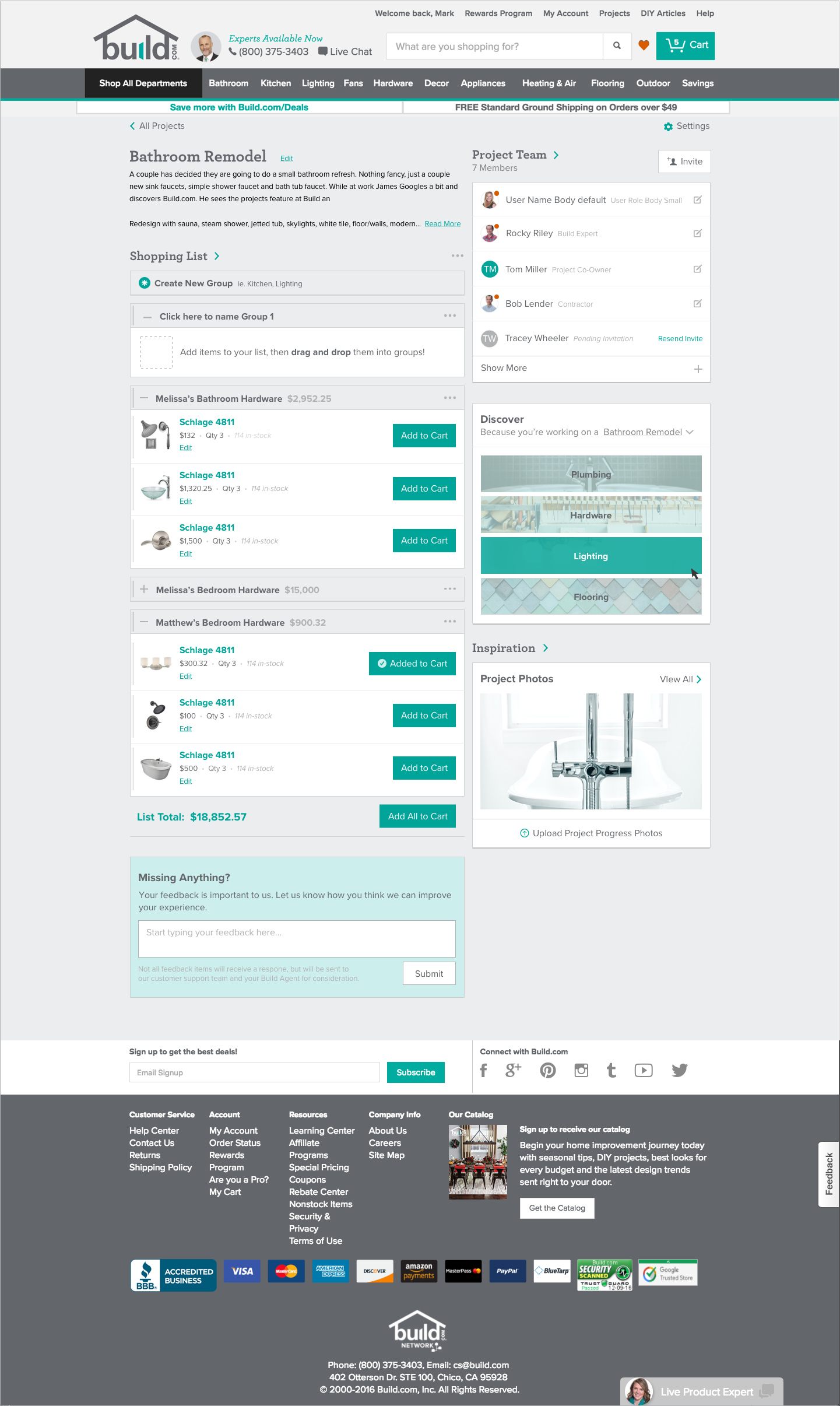
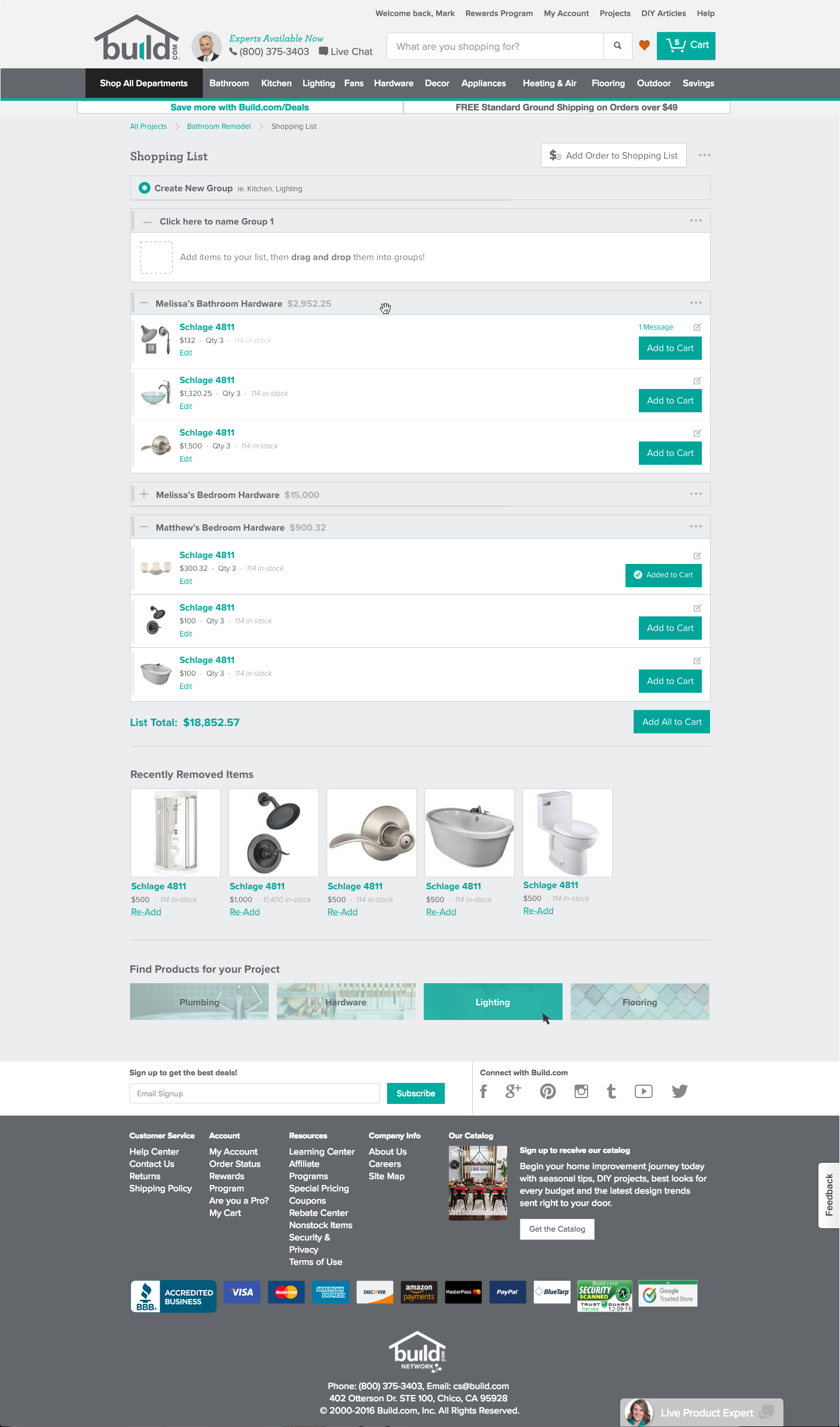
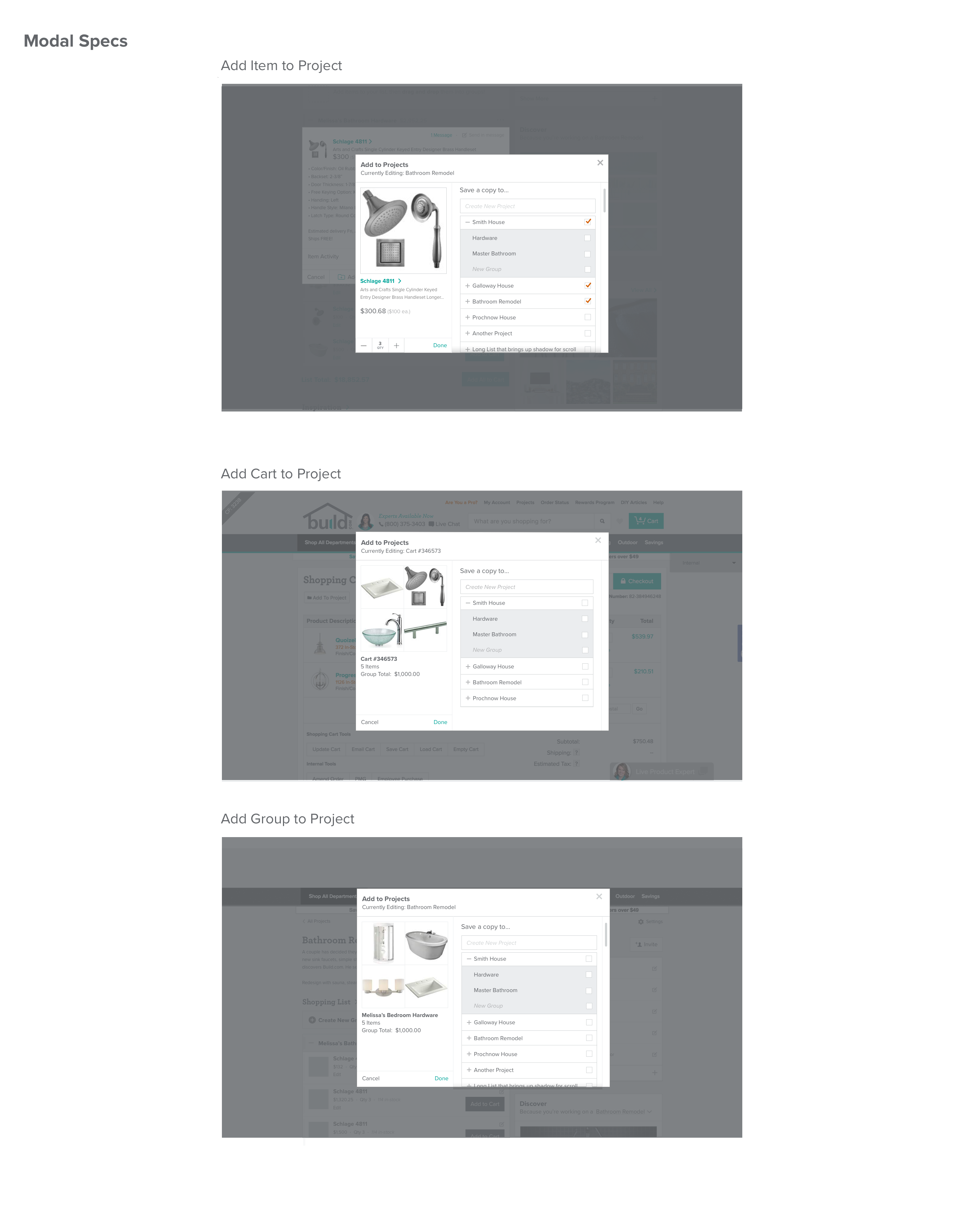
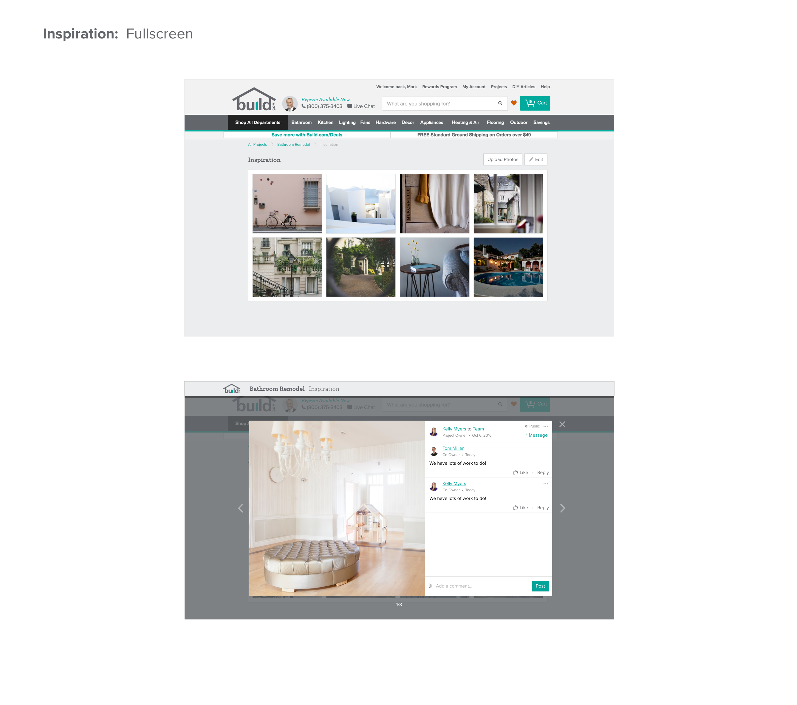
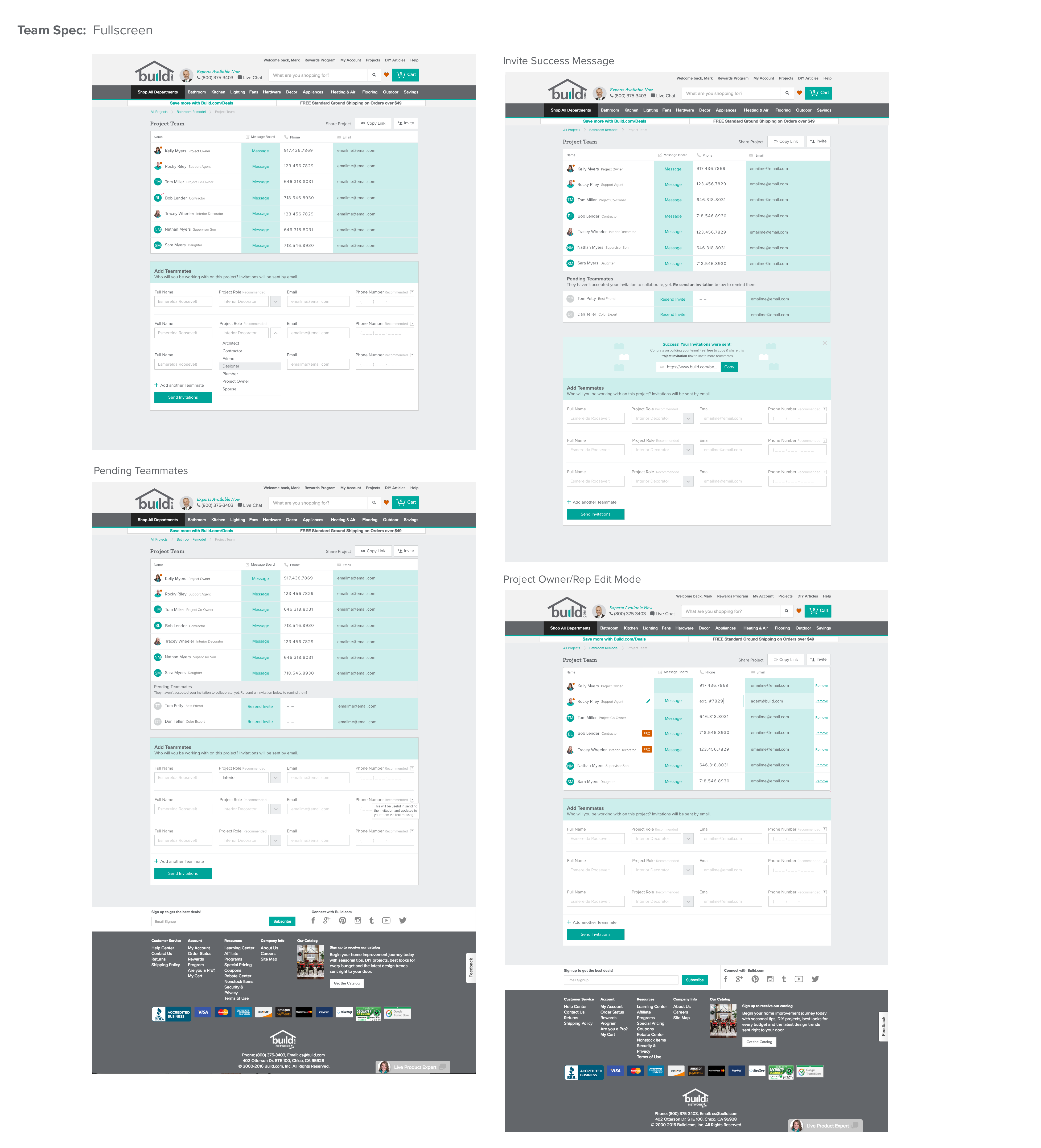
Finding and purchasing products for large projects is difficult when collaborating with a partner, contractor and Build Project Advisor. Communication between project team members is a consistent point of contention for our user base. Project progress updates will help increase trust within a team through transparency. This tool is used both internally and externally to manage home improvement project needs. Our in house Project Advisors organize and recommend products per room in one place. Users can also use the tool for free for any of their project needs.
Desktop & Native Designs


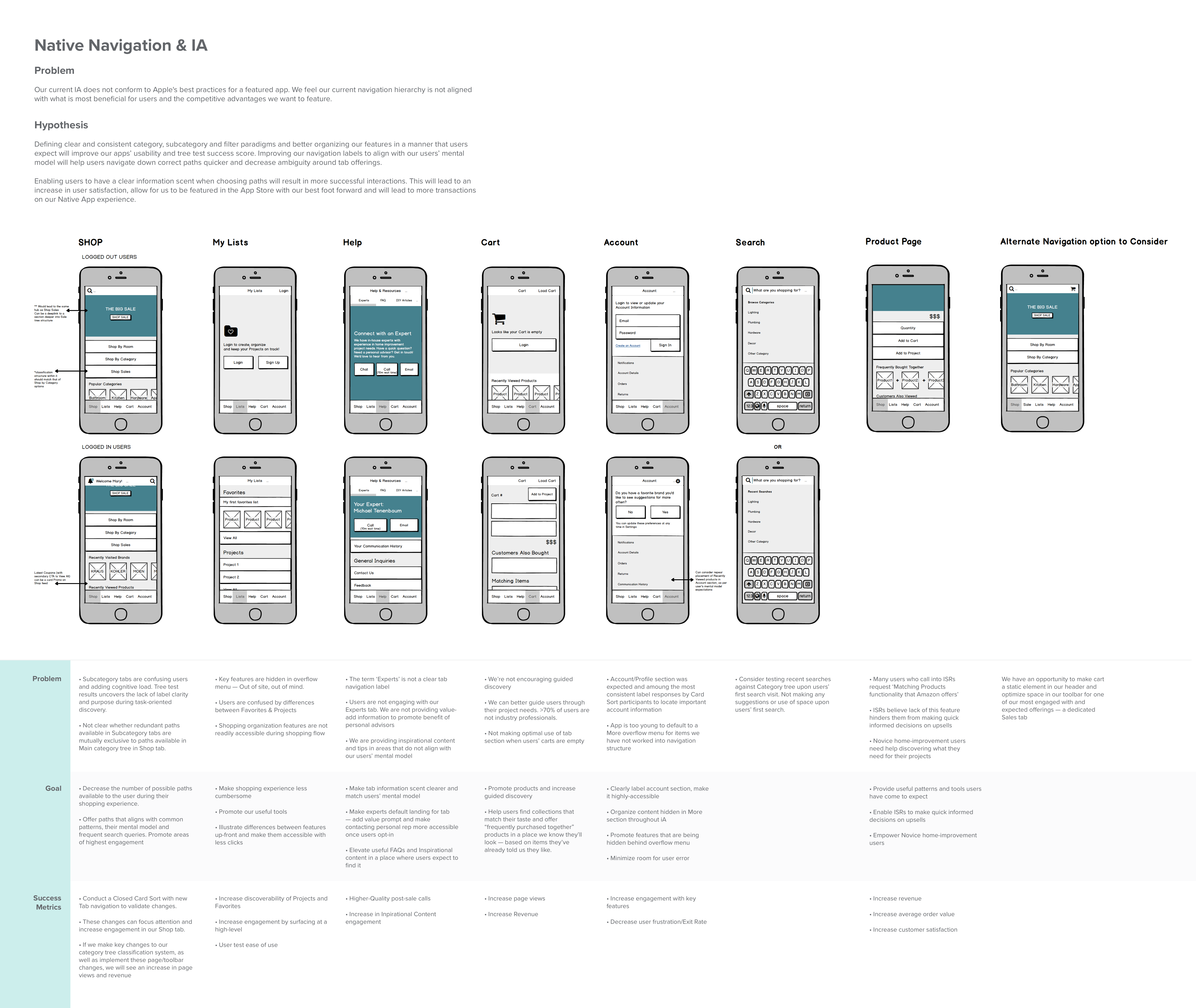
Native Information Architecture
As part of our end of year initiative we spent more time making improvements to our mobile web and native app experiences. Although our native app is less than a year old, we began to realize our app's information architecture was beginning to suffer.

High-Level Takeaways
After conducting an open card sort, tree test, qualitative and quantitative research I found the following findings —
We had a 31% Success Rate on our Tree Test
People are unsure about what our Pro label implies in our shopping flow, internally and externally
Research & Prolific feedback are consistent – we’re concealing key shopping features in an overflow tab that users do not visit frequently
Users expect a hub for Customer Support needs and our Experts tab is vaguely labeled providing little value-add information
Users expect 1 hub for sales, coupons and clearance items
Users expect an explicit Account Section
Deliverable
In an effort to keep design solutions high-level before scope was defined, I used Balsamiq to loosely wire-up potential solutions to test. The hope is that we make changes to the app experience incrementally and a/b test our way into these improvements.
Next Step
One of the biggest takeaways was that our app's information architecture is limited because it is inherited from our website's iA. Our desktop navigation is currently used as more of a marketing tool and is negatively impacting our navigation on desktop, mobile web and native. As a follow-up to this project I was asked to make visuals for short term fixes to our app experience. Next, I will be partnering with our marketing team to find an ideal compromise to test into. I'd like to conduct a tree test with iA changes that keep our users and best practice category paradigms in mind.