Editorial platform and online learning startup designed to enable creativity through inspirational content.
Role Lead Product Designer Team 5 engineers, 1 Product Manager
Homepage Redesign
One of my final projects with Brit + Co was to redesign the Homepage. For a long time this homepage served as a store-front window for what we offer as a brand, but it also strongly effected team morale. We wanted to work for and stand behind a website that prided itself on creativity and looked the part. It's also something of a first look into the site for investors. Stakeholders were highly invested in the project. This made for a slightly different approach than the process I took for most other projects.
To view the old Brit + Co homepage, click here
Process
This project began with a kickoff meeting that revealed diverse stakeholder visions for the homepage. To focus the conversation, I conducted an internal survey asking each stakeholder to prioritize must-have elements and features. I created rough mockups of the strongest consensus ideas, then user tested the top two layouts using 5-second screen preview tests to understand what stood out and how participants interpreted key page elements.
With all stakeholder ideas represented and unbiased user feedback in hand, we streamlined the conversation and aligned on a concept that met each department's goals. I then brought the final concept to life through wireframes, development collaboration, high-fidelity visuals, and interactive prototypes.
Final Design
While I was no longer with the company to oversee QA, final implementation or success metrics, I have been delighted to see that a good number of the final design concepts were worked into the homepage that is currently live on Brit + Co's website (7/31/17).
Article Page Redesign
Users come for a particular article and often bounce. Additionally, our data indicates engagement is highest for our DIY content and so we wanted to provide a more compelling experience for the recipes and tutorials we're known for. We also wanted to get rid of the right rail on desktop as it became a blind spot for our users. I was challenged to incorporate related content in a way that would increase engagement and time spent on site. I redesigned and introduced new article pages formats.

Objectives
Increase overall time spent on articles and lower bounce rate
Adopt contemporary and forward thinking design vocabulary
Introduce variation in article types
Offer readers more relevant content and a clearer way to start the guided discovery flow
Begin to explore “programmatic” technology that allows us to encourage customers to take more relevant / revenue generating sessions and experiences
Wireframes
To get started on this project, I interviewed a number of our key stakeholders and conducted a sketch session. In a time-boxed manner, participants dreamt up and presented their ideal article page formats. I drew inspiration from these insights, as they were specific to the goals of different department verticals and constituent types.
I did a great deal of competitor analysis, rounds of wireframe iteration, critiques with the product design team and lead product manager. Eventually, I narrowed down and reviewed options with the stakeholders.


Visuals
Final Design
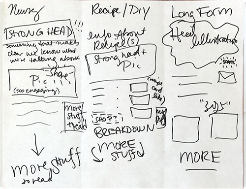
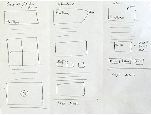
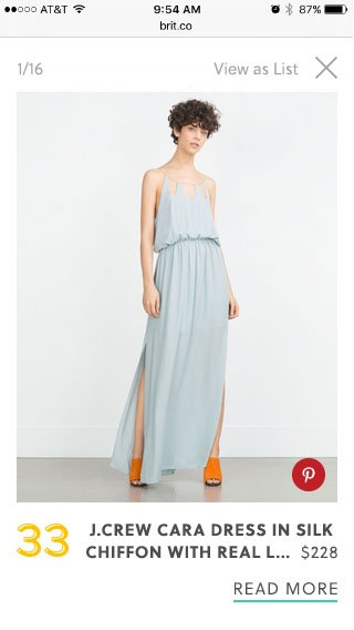
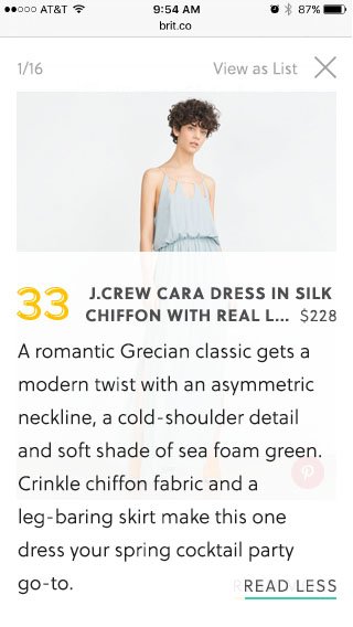
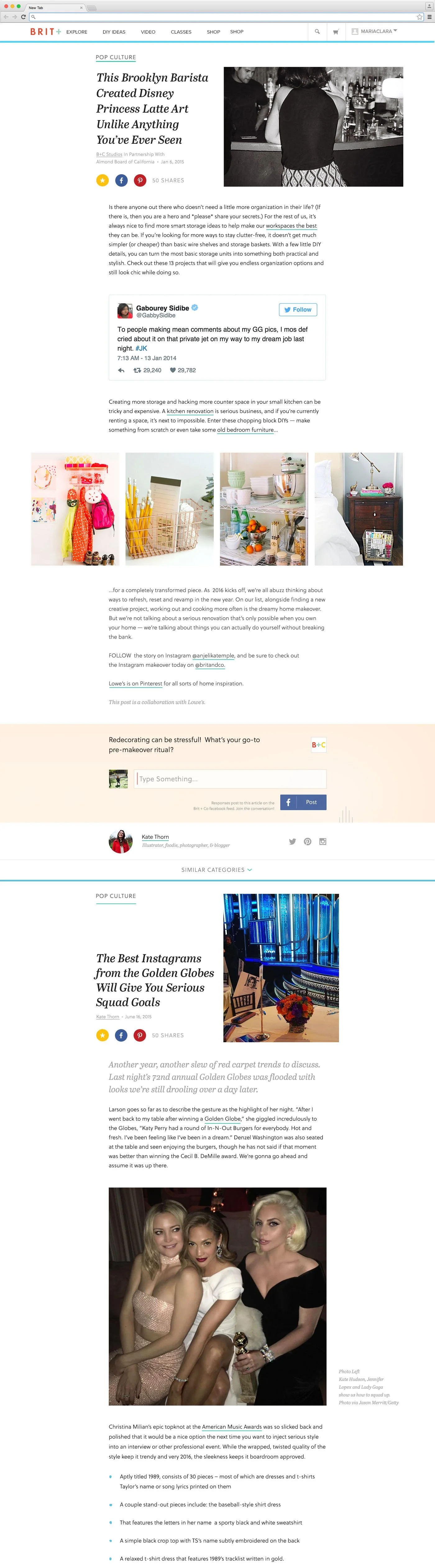
A complete article page overhaul to a user-focused, clean and more engaging experience. I proposed four new article templates for our varying content types. Included were featured, standard, DIY and list format types. This redesign included a new typeface which allowed us to stand out from our competitors
To encourage discovery and increase time spent on our site, we included modular units which allow users to discover related content at an average scroll depth when users generally leave a post. The redesign also allowed for users to scroll directly into the next story within the same subcategory. The next article could also be accessed quickly with use of a contextual navigation that animates down when a user scrolls up on mobile and anchors you to the next story.
Standard Article
The standard article layout is designed to suit the majority of content types. This included stories that do not use in-house photography. All article types include photo gallery capabilities which allow editors to add a grid of images to a story. Users can tap on an any image to view it in a lightbox presentation.
I also introduced image size constraints to keep the experience mobile user friendly and maintain consistency.
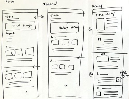
Tutorial Article
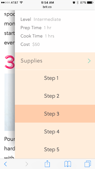
In depth DIY and recipe content are what make Brit + Co’s brand stand-out. We photoshoot these original articles in-house and take pride in demonstrating each step of our tutorials in full detail. Because this can result in a very long vertical scrolling article, I introduced backend logic that can help editors break out their process into concise steps. This was accompanied with a front-end contextual nav feature that made steps more accessible.
Features include varying photo layout options, a contextual navigation that will display upon scroll up with shortcuts to steps as well as a built in photo animation UI. This would allow editors to upload multiple images pertaining to a particular step. Users can then decide if they'd like to play the step as a GIF or thumb through individual process shots.
Listicle
A great deal of our inspirational stories within our DIY and Beauty verticals consist of ‘listicles’. To add appeal and clearer hierarchical distinction between elements, I designed on-brand numerical formatting to be used along with layout variance for engaging article presentation.
By default, articles display in list view, but users can opt into a slideshow display on both desktop and mobile.
Next Steps
New article types started out with MVP standard article format going through a/b testing. Early results of the Standard article page alone indicated an average 9% decrease in bounce rate and 24.3% increase in page views per session. While a number of features will trickle in slowly, it's been fascinating to see results coming in on how the Standard Article type has been performing. Because our article pages are highly trafficked, it is imperative that this redesign meet our success metrics. We will be agile in making any adjustments as more quantitative data rolls in.
Category Page Redesign
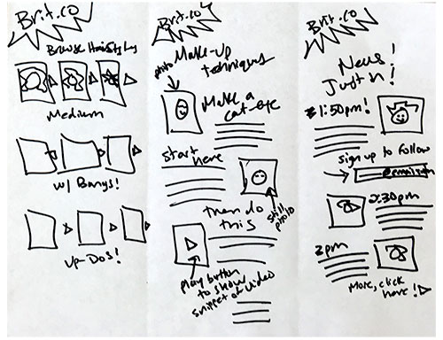
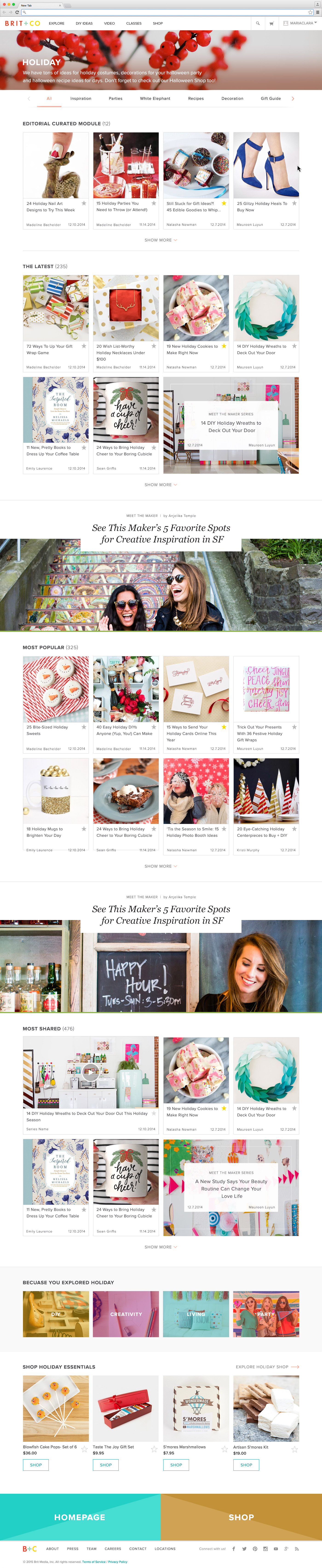
The category page redesign was prompted by the need to make our breadth of content more accessible to users. It was during this project that I proposed the idea of a modular design system that has since been incorporated throughout the site including article pages, product pages and the homepage redesign. Modules allow editors to program or curate portions of the site on a regular basis based on relevance and sponsored campaign schedules. We could also leverage users behavior to promote seasonal content. The objective was to make the best of what we had to offer highly accessible within each category.
Goals
Need for optimized landing pages and improvements to site hierarchy and SEO
Organize articles in a meaningful way
Make articles accessible for mobile users
Allow users to discover our breadth of content per vertical, including long-tail articles that are evergreen and remain highly-relevant
Introduce new design vocabulary and components for use in homepage and article page redesigns


Wireframes & User Testing
Before starting on this project, I conducted a quick user test on the original design. This provided insights around where users experienced the most trouble completing basic tasks. Once results were in, I devised wireframe options to review with the product design team and stakeholders. I was able to narrow down to two strong directions (for both desktop and mobile), build a simple prototype and user test them.
Users preferred to interact with filtering options when they were exposed and available with minimal taps
Users were responding positively to the new section/module organization, as it provided more context on the types of articles available to them within a category
Vertical scroll would be more successful for densely filled modules
The 'Show More' and sectioning approach was scoring higher than our previous infinite scroll of chronological articles
Final Design
An exposed responsive subcategory navigation was designed to follow users down the page, allowing them to filter their search further at any point. The modular system introduced in this design paved the way for conversation around guided discovery. Next, stakeholders wanted to optimize the experience to be more personalized across products, including for article pages (which was my following project) and product pages.
Engagement on these pages increased as a result of the redesign. We saw an increase in traffic to category pages as well which we attributed to introduction of breadcrumbs in article pages and modular designs incorporated in article pages.
This design is now live on Brit + Co, click here to view.
Next Steps
Work on Lemondrop, as this project is called behind the scenes, is on-going. We still have some work to do in order to prevent the entire page from loading when a user chooses a subcategory filter and to make the navigation sticky. We have a few more sections to include at bottom to encourage continued discovery. We've also made changes to the mobile view of cards across the site after launching this project. We will continue to monitor performance and address enhancements as needed.
One of the larger projects I wanted to tackle since joining the team was the site navigation. During the design process it became increasingly clear that our content taxonomy needed a great deal of reclassification. Furthermore our information architecture needed work. While category pages are more useful, we needed to better organize our content as a whole to increase accessibility. The product design team and I have since proposed a Navigation redesign using data collected during this project. Additional research is underway including card sorts, tree tests and stakeholder interviews to come to a user-focused universal navigation that keeps our majority mobile audience in mind.

Modular Design
I proposed the concept of a modular design system during my work on our category page redesign (shown above). I worked closely with the lead product manager and developer during the duration of this project. It was important to keep the highly-trafficked areas of our site up to date and curated with the best content. Users should feel as though we're serving them content that is highly personalized to their interests. There was also a need for these areas to work as moving components across different areas of the site.
Goals
Recommend content based on user interest using information they've provided
Increase engagement across the Brit + co platform
Use scroll-depth data to assign proper placement in articles
Provide user tools that encourage guided discovery
Final Designs


Next Steps
This project is currently being shipped! We will monitor data coming in as to whether this tool improves time on site. When I began working on this system, I was hoping to make use of algorithms that would allow users a personalized experience based on the content they've already expressed interest in. We would benefit from using information such as their referral source, time of day and weather based on their location to assure content stays highly relevant. Feedback inputs across our site could also help us improve this experience.
It became clear early on in the design process that we were unable to allocate enough resources to such algorithmic work just yet; we would need to make use of tools we have at our disposal to populate these modules. MVP will allow modules to be set to particular topics. These modules can be curated by hand or programmed with use of tag pages. We could leverage existing tag pages or create new ones specifically for a collection. Benefits of programming with tag pages include automatically updated modules as writers add the tags to new articles.
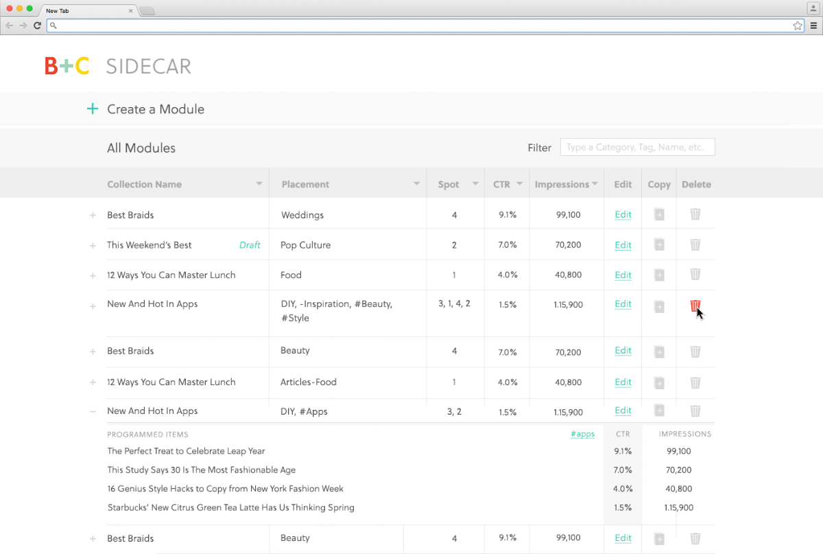
Custom Programming Tool
To program modules (shown above) and campaigns — I worked directly with the lead PM and engineers to build a programming tool. This interface serves as a back-end system for internal use. It allows us to track the success of modules using location on site, on a page, and even as granular as the item number within a given module. Data can be tracked directly from this tool, modules can be created or edited and scheduling is soon to come.
Objectives
Provide an intuitive, scaleable experience for editors and marketers to create collections
Present intentionally grouped content with authority on the subject
Allow Brit + Co to blend content and commerce experiences across the site
Design systems to support guided discovery
Process
One of the benefits of building this internal tool is that I was able to interview the users with ease seeing as how we worked from the same office! I've found that learning how our editors work and their bandwidth made it clear that the tool needed to be highly-efficient. I was also able to do comparative analysis by assessing the tools they use on a regular basis. By dogfooding after each iteration, I was able to device a phase one of Sidecar, as we call this tool behind the scenes.
Final Design
Next Steps
This project is ongoing and involves an iterative process. Enhancements are developed as features launch on site. Because I work among the people who use this tool, I am able to quickly gather feedback from our editors as to whether the tool is as efficient and intuitive as it can be. One takeaway I have at the moment is the complexity of slots within a curated module. If all content slots are taken, a user would have to delete an item in order to shuffle the other items' order. This appears to be fine for phase one, but is something I would like to address.
Another note is whether the editors find it useful to have the All Modules section available to them at all times below the module creation form. At the moment, when users build these modules, they treat this area as a blind spot. In theory, it would be a good way to view whether a placement on a given page is taken, however if editors don't make use of it, it may be adding unnecessary clutter.